Home
The first page after login. Sets the tone: this is a place for running queries, not just looking at dashboards.
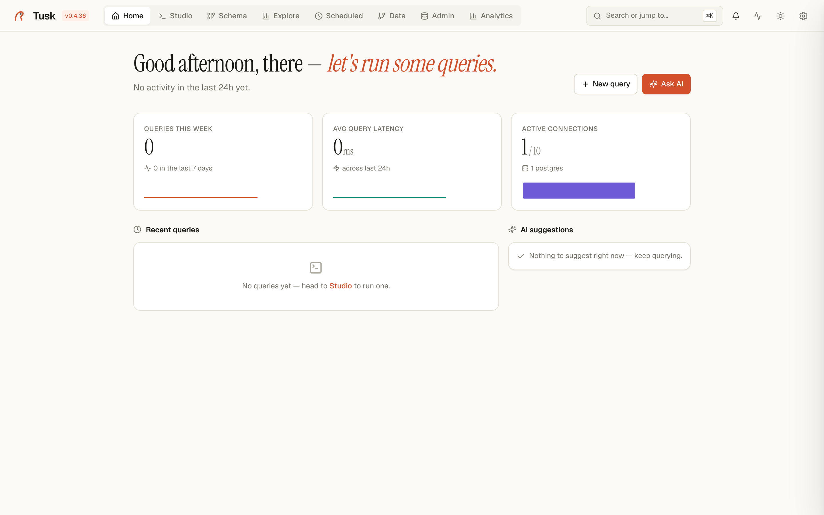
Home tab — KPI cards, recent queries, AI suggestions.
What's on the page
Hero greeting
A serif-typeset line: "Good morning, there — let's run some queries." The phrasing shifts by time of day (morning / afternoon / evening) and shows your last-activity summary right under it ("No activity in the last 24h yet" if you're fresh; otherwise a count + most-recent timestamp).
To the right: New query + Ask AI buttons. Both jump straight into the Studio with an empty editor or an AI-Copilot-primed editor respectively.
Activity stats (top row)
Three KPI cards that snapshot how the platform is being used:
| Card | What it shows | Source |
|---|---|---|
| Queries this week | Count of queries run in the last 7 days, with a sparkline by day | ~/.tusk/history.db |
| Avg query latency | Mean execution time over the last 24h (ms), with a sparkline by hour | ~/.tusk/history.db |
| Active connections | Currently open Postgres connections out of the configured pool max, with one dot per active connection | psycopg pool introspection |
The connections card breaks down by registered Postgres connection ("4 postgres" in the screenshot — one dot per backend). Click any dot to jump to that connection's Admin view.
Recent queries
The five most recent successful queries you've run. Each row:
- Connection name (in monospace).
- First ~80 chars of the SQL.
- Row count + execution time (badge colored green for fast, red for slow / failed).
- Date of the run.
Click any row to re-open that query in a fresh Studio tab. Errored queries show a red warning icon — click to see the full error message.
AI suggestions
The Copilot watches your recent activity and surfaces suggestions: queries that timed out and could be optimized, tables you've never queried, common patterns you might want to save. When idle, it shows a friendly "Nothing to suggest right now — keep querying" message rather than empty space.
Why this layout
Most tools start you on a dashboard list or a connection picker. Tusk starts you in the query mindset, because that's where the value lives. The stats cards are quick health-checks, not a destination.
The hero greeting + serif font are deliberate — they signal that Tusk is opinionated about feel, not just function.